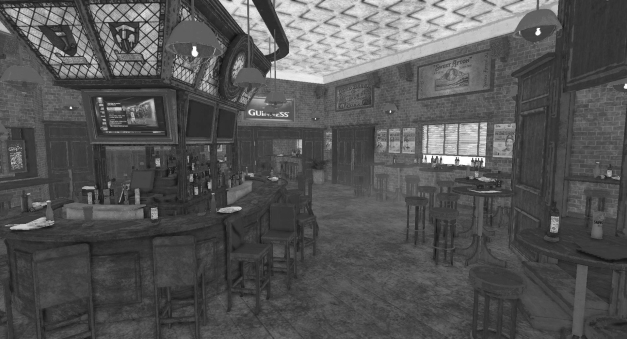
So in part 2 I will let Corey Hill explain the process he went through with the critiques and improvements of his bedroom scene. On part 1 I explained how texture values are so important for environments when it came to bounce light and general feel of a environment. Due to texture value fixes Corey Hill on his own found out that some of his assets in general needed a full rework, which I knew but I did not want to bother him with too much information at the time. I imagine Corey taking a deep breath of frustration at some point and instead of doing what most artists do and moving on… He got to work! Work he did! Below shows the process of which Corey received nudges from others and I in various communities to move him forward, but at the end Corey is the one who put the effort. The bedroom is now a scene that I think Corey should feel extremely proud of, and in my opinion went from being his worst to his best in his portfolio. I particularity saw strong potential in this scene because it was the one scene that had more of a story element than the others… So it would have been a real shame for a scene with this potential to be drowned down by technical and art direction woes. Honestly I know very few people who can take the beating of critique after critique Corey did. I definitely see a bright future for Corey and if you were ever to need a recommendation I would gladly do it. I have never met Corey besides online chat. Thank you Corey for being a good sport.
Corey Hill’s Article explaining the process below…
Hey guys, so the part 1 thanks to Rogelio was pretty successful in terms of the amazing amounts of knowledge he shared at the expense of me as the lab rat! With that said not only did you guys learn alot, but so did I. It forced me to revolutionize my workflow in terms of working with cloth through the use of Marvelous Designer 5 as well as really evaluating whether a composition suits certain times of day.
Here was the base example that Rogelio provided you guys with:

Wow how can anyone see anything? Terrible right!
Furthermore I did an unlit version, and much like Rogelio mentioned is had AO on but by no means was that an excuse for the terrible texturing and lighting that had occurred up to that point.
My first pass brought up some interesting idea’s in playing with the composition which is one of my weaknesses as here was the result of the first pass according to Rogelio’s advice of brightening things up across the board:

Rogelio’s advice in this was to really brighten up all the textures overall to see what it would do in terms of what I now see as it revealing some of the changes I needed to make without people holding my hand and walking me through the process.
1st Pass:
Better? Ehh debateable. The important thing was that if you noticed I removed the shelf, added a bike into the hallway and played with the moving around of pillows and props. Basic set dressing. What people consider as I have been told my strong point. Taking out that dresser allowed me to really see that in all honesty not only was the lighting terrible but the blankets modeling was atrocious and that was what Rogelio was trying to get me to notice without leading me directly to the answer. The old adage, “Give a man a fish and you feed him for a day. Teach a man to fish and you feed him for a lifetime.” By taking out the dresser unit and discovering that things just were not working with the night time lighting as well as revealing some of my weaknesses I felt the reward of my own evolution and found the answer myself.
What this revealed is that sometimes in order to build up true form and get to a final result that works we need to take away some form to get there. If you are ever having issues with composition, lighting, etc, obviously forums like 10k, environment artists of the industry, etc, will always help and I highly suggest posting to regardless of skill level, but taking away things and going back to the basics can also help you work out some of the kinks as well.
Moving to the second pass I decided to entirely scrap the night time lighting. It just wasn’t working. It was a situation where you’re working for hours, you’re in the zone, and you forget to save and all of the sudden pesky Maya crashes and while autosaves can sometimes recover your work, more often than not it doesn’t and while for the first 30 minutes or so you’re pretty pissed, when you go back to it it almost always comes out better in the end. Repetition breeds excellence.
2nd Pass:

Getting somewhere…. A little bit. Notice I’ve placed the dresser back in there. I also added decals which are pretty important in breaking up the monotony of tileable textures or similar textures. There are many individual props, but even with all the posting I was doing it still was getting grilled for the lack of sense my grime made, as well as the lighting of the lamp on the left side, and the directional light. The scene was still flat for a variety of reasons. The primary reason was there was no bounce light, or very little rather occurring. Remember if it looks cool and is functional, that’s your best result. If you make things pretty just for pretty sake it never works out. Often in video games it’s grilled if you have a pretty game but no gameplay or functionality. You have to find a happy medium which is of course not always easy to do. Once again it’s important to get feedback from eyes that see things differently than you. Sure you may not be able to see what needs to improve now, but a master artist could easily spot probably a million mistakes in this piece, even with the end result you will eventually see that I am relatively happy with.
3rd Pass:
Now we’re getting somewhere!!!
So the lighting stayed relatively the same. So what changed.
The fabrics and cloth. I would get feedback and no matter how much I changed, you can’t make a piece of crap look good. The previous blankets were awful for a variety of reasons. The folds made no sense, the scale was off, the textures were atrocious, and there was no color cohesion or layering between what a bed is composed of.
Breaking down and object can often help you decide how to improve your scene.
Generally it’s said to start off with the hero prop, which for some could be any sort of objects in this scene, but for me was the bed. So my one hero prop, the one piece I should have taken pride in I skimped on and the end result was a polished piece of turd. No bueno.
So next step: Learn Marvelous Designer 5!
How did I get decent results in such a short period of time? Remember this entire process from my switch to day lighting, to the current result you will see at the end took around 2-3 days with very little sleep. It’s how I run haha. Tutorials. That’s easy to say on a variety of levels.
The artists who do bad in the industry if they manage to crack in are the one’s with egos from what I have seen. If you’re not willing to get feedback, if you’re not willing to accept critiques from your art director *shudders*, and you’re not willing to work in a team with no attachments of ego you will never make it. Sure you can do a short sprint, but this industry is a beautiful and well connected one, if you make a fool of yourself in the short run, in the long run it will never pay off.
Why am I saying this? I often see people a. Looking to be handed the answer without doing the research. It’s a weird stigma of this generation to have things immediately at the touch of a finger.
Why did I finally have a personal breakthrough? Remember the fish quote? Rogelio guided me to the answer with some smaller general critiques, and while no one really critiqued my blanket too harshly, the fabric was still such a profound issue that by the time I had changed it, by the time I said okay this is something I need to do, I had to to the research and I was much better off for it. I can add a whole program ( at least a basic understanding) of Marvelous 5 to my resume! So never think you are weak for needing a tutorial or asking for help, but go and do the research yourself first it will make you so much more powerful.
Rant aside, here’s the hero I used to learn Marvelous 5. Gratefully it was all relevant to my current modeling necessities as well; http://viscorbel.com/bedding-tutorial-marvelous-designer/
So with the blankets out of the way, the pillows out of the way I needed to make huge changes to lighting, etc. Which brings me to today’s effort (as of 6/25/2016).
Bounce light! Super critical. If you remember Rogelio’s breakdown of my scene he directly quoted the Unreal wiki:
Rogelio’s Breakdown of my work:
https://environmentart.wordpress.com/2016/06/13/texturing-values-for-environments-part-1/
Unreal Wiki breakdown:
http://udn.epicgames.com/Three/TexturingGuidelines.html
I had brightened my textures, but I didn’t have too much bounce causing some flat and atrocious lighting. I needed to change the directional light to have it first hit the floor, and then after a few bounces it still wouldn’t be enough.
That’s where faking alot of the lighting is important as well.
My personal process is to use HDRI’s in my lighting. Personally for me it gets the best result.
Once again I love tutorials. It’s a learning process at my own pace outside of a classroom environment.
http://rag3dviz.com/tutorial/hdri-lighting-in-unreal-engine/
Here’s what I used. It get’s pretty solid settings. You’ll have to of course find your own HDRI image site but at this point the internet has billions.
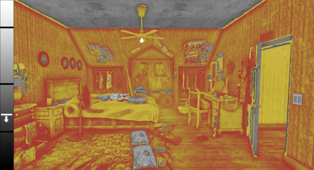
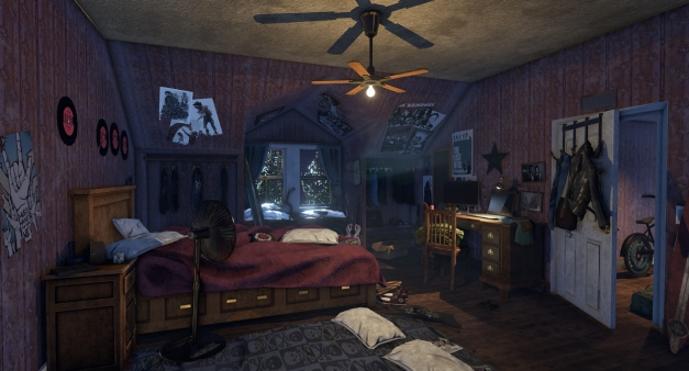
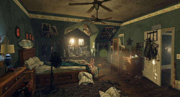
4th Pass: Final (Yay, cheers, crowd goes wild (or at least me cheering in the background alone)):
You can see that there’s a pretty noticeable difference in the end result from even pass 3, but especially from pass 1, my god!
Note: This is contrast adjusted in Photoshop as I am on a non color corrected laptop so color and contrast can sometimes be a bit of an issue with me as well.
Things I changed in the final pass.
- Separated the posters to get them closer to the walls
- Entirely remodeled the walls, the hallway, and the closets, and small alcove for the windows (this was necessary because much of the feedback was harsh edges). The original models from about a year and a half ago for some of the pieces were so inefficient that I had to re-model them entirely, merge the verts, and unify the bevels all together to get some rounded edges.
- Added some contrast per Rogelio’s suggestion on the closest left wall with a beige color which contrasts pretty nicely with the blue poster, but still too much for the records on the wall (of which the specular values are off anyways and the models are awful).
- Added a few spotlights to fake some of the bounce lighting. The first one is the alcove. To neutralize the harsh dark change that it was having in previous passes. The second one was directly at a 45 degree angle downwards towards the blanket. This was done to get a harsh but nice lighting cascading across the blanket texture. And the 3rd and final one close to the floor aiming up to the opposite wall of the beige color. This brightened up the blue wall with some warm contrasted colors against the cool textures. It also provides some harmony amongst the redish/brown woods.
- Added an overall relatively ambient point light with some fall off with a brightish orange.
- Added some ambient dust (personally don’t like it but it’s an extra touch I guess).
Final things to Note: Rendered out by pressing G, F11 for fullscreen, and then the drop down arrow and high res screenshot at 3.0 x the base size. I always see people take pictures with their camera phone, if you do this shame on you! =) Downsized in photoshop after and adjusted the contrast quickly with auto-contrast.
Things that still need to be done: Full breakdowns of at least the hero prop. Super critical, I can’t tell you how many times I have been asked for breakdowns on my workflow and had to take art tests simply because they weren’t sure if I could actually do the work I was doing because I had no breakdown on how to do it. As soon as I started doing breakdowns I actually was able to skip some of the art test stages and just had to impress in the interview stage. So do breakdowns it shows how you think, and who knows you might find some issues while doing them and it will make you better at self evaluation which is what the master artists of our time excel at!
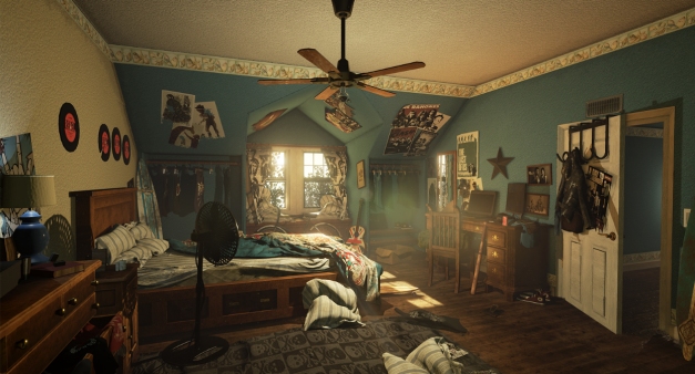
Final Unlit Screenshot:

Super bright! Super happy! Now this won’t always be the case for some environments, but overall the critical thing here to learn is to work above 50% grey, and in the end a good rule of thumb is to go brighter always instead of darker, and test, test, test! All you really need is 4-5 solid pieces that really convey artistic breakdowns which will show if you’re a fit with the team in the first place, if you possess skill in order to work at the quality next gen requires, and shows most importantly consistency. In any job, consistency is key. Consistently evaluate yourself and your work, consistently get feedback, and always remember to consistently check your ego and understand that critiques are only there to make you better! Take care guys, I hope me being a lab rat broke you guys out of your own fear of getting feedback, and I am always available for the help if you need it! Cheers!
-Written by Corey Hill
Direct Link:
https://www.artstation.com/artwork/XPknL
Portfolio Link:
https://www.artstation.com/artist/coreyhill